
Overview
Museums are a great place to learn, but navigating them alone can be frustrating. Information can be hard to process and/or retain. GalleryPal is a museum exploration and education app that simplifies the museum experience to facilitate greater learning and increased engagement. It makes art more attainable and museums more digestible.
Role
User research
Ideation
Visual design
Prototyping
Testing
Tools
Figma
Photoshop
Platform
Mobile
(Note: as a prototype not all features function)
[On information retention at a museum]
“It feels a lot more like in one ear, out the other sort of deal.”
-Participant 4

Defining The Problem
In One Ear Out The Other
The Problem:
Museums and galleries are not happy with the level of customer satisfaction. Information can be hard to process and/or retain. GalleryPal is a museum exploration and education app that simplifies the museum experience to facilitate greater learning and increased engagement. My design challenge was to re envision a museum app to improve the in-person viewing experience.
Constraints
Focus on improving the in-person viewing experience.
Client wants the solution to be designed for mobile devices or mobile-optimized web.
Due to the time restrictions, make high-impact design decisions, build the features that actually help the users.
The Solution:
Due to the time constraints of the Design Sprint I needed to begin solution finding quickly. With data provided by the client I began piecing together solutions. I still went through the design thinking methodology: empathize, define, ideate, prototype, and test to best understand my users and their needs, but at an accelerated pace.
The focus on the user's in-person experience while at the museum helped determine that the solution needed to be a mobile app as phones would be the most accessible and common tool for users in a museum or art gallery. With the design constraints provided by the client, I designed a mobile app to simplify and improve the museum learning experience, focusing on user needs and ease of use.
Design Process
What Did I do?
My role was to undertake the whole project from concept to creation and everything in between. I worked on research, evaluation, design, and iteration. In the figure below you can see how I implemented The Design Thinking Model used and work completed for the modified Google Design Sprint.
Day One - Empathize
Understanding The Problem & The Competition
Research
I explored users and the persona from the client to determine what functionality would truly benefit the user. From the brief I had an understanding of the problem space, but I needed to understand users’ frustrations and their motivations.
Persona
Angela • 23 Years Old • Junior Art Director • New York, NY

“I enjoy going to the museum, but I often leave feeling like I didn’t appreciate the art to its full potential. I don’t need to know everything, I just don’t want to feel like I was missing out on something”
Behavior
Goes to museums every couple months mostly alone
Browses artwork freely
Frustrations
Better museum experience if she knew more
Loses interest in books and articles
Goals
Get quick information while looking at the art
Have a better appreciation of the art pieces
Make the most of her visits

Key Participant Findings
Participants enjoy visiting museums and galleries
Participants want to learn and appreciate the art
Participants find articles and books overwhelming
Participants want background and context
Participants like to enjoy art alone, but appreciate group tours
Participants want to learn more about process and technique
Insights From an Expert
Lena Carroll • 20-30 Years Old • Tour Guide • New York, NY

Typically people who come on the tours don’t know that much
Her goal as a guide is to help them create a story
Wants them to understand the story or the intention of the artist
She wants them to get more info than if they were just walking around by themselves
Tragedies often resonate with guests
She wants them to go in objectively and come out having their own opinions of the art
She highlights a combination between context and info about the artist and info about the actual work
At the end of the day the art is about the artist, but it’s also a medium to understand yourself
Take time with the art, sit with it, experience it
Synopsis
Museums are great places to learn and experience art, but users often are frustrated by their lack of knowledge or where to begin learning. Users want to experience the art without feeling like they are missing out on information, so they can appreciate it to its fullest. Users do best absorbing information when it is brief and often lose interest when information is lengthy.
Most users don’t know much about the art when they go to museums. Curators and tour guides want users to understand the story of the art, to be able to sit with it, experience it, and appreciate it. Key information includes, how they grew up, how they became an artist, how they created the piece, tragedies and fun facts really resonate with users as well.
End to End Maps
Having done initial research to better define the problem, I began considering possible solutions by drawing out end to end maps. Starting with the guest or user and walking through the possible steps leading to the goal of appreciating the art. I considered different maps and continued to iterate to discover other possibilities. I mainly considered maps that included QR codes, but also considered Augmented and Virtual Reality as possible factors to the solution.
Recruit Participants
Next, I sent out a screener survey to select participants who best matched the user. I kept my survey simple. I just needed to determine whether potential participants go to museums, enjoy learning, don’t feel overly confident about their art knowledge, and don’t feel that they learn a lot.
Do you visit Museums/Art Galleries?
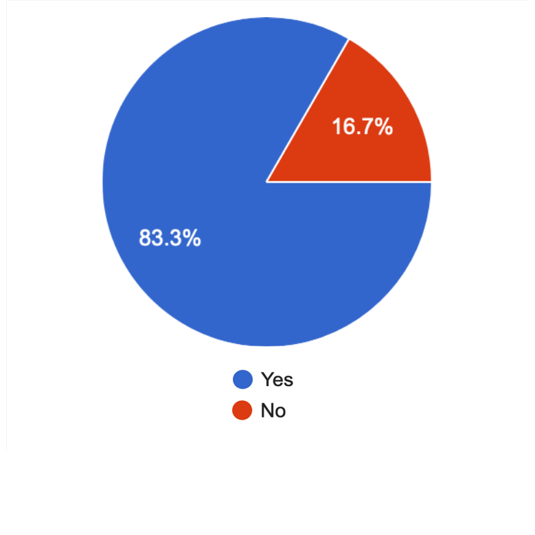
Do you enjoy learning about art?
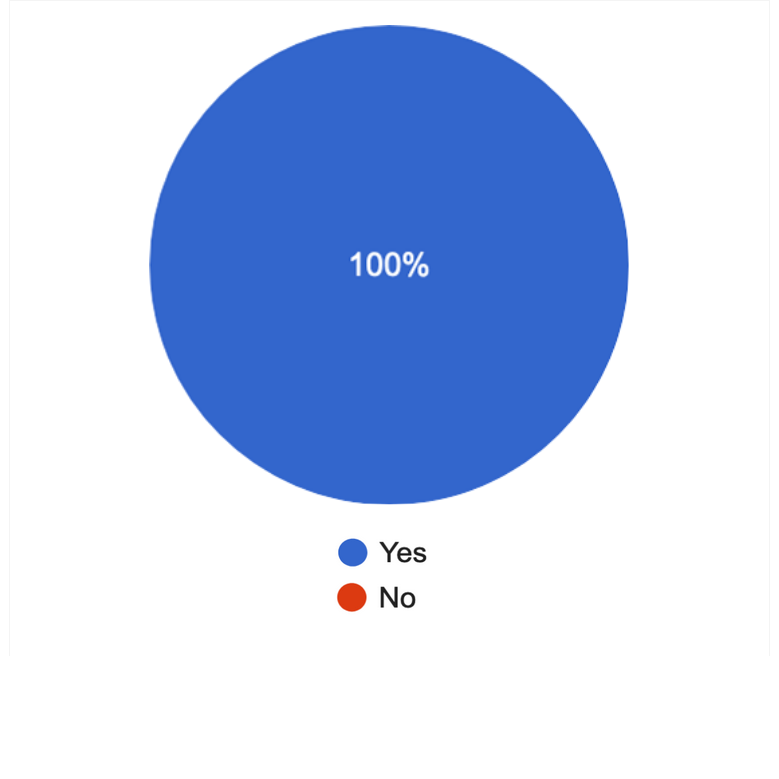
How knowledgeable do you feel about art when you first go to a museum?
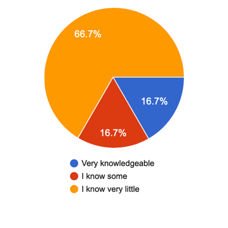
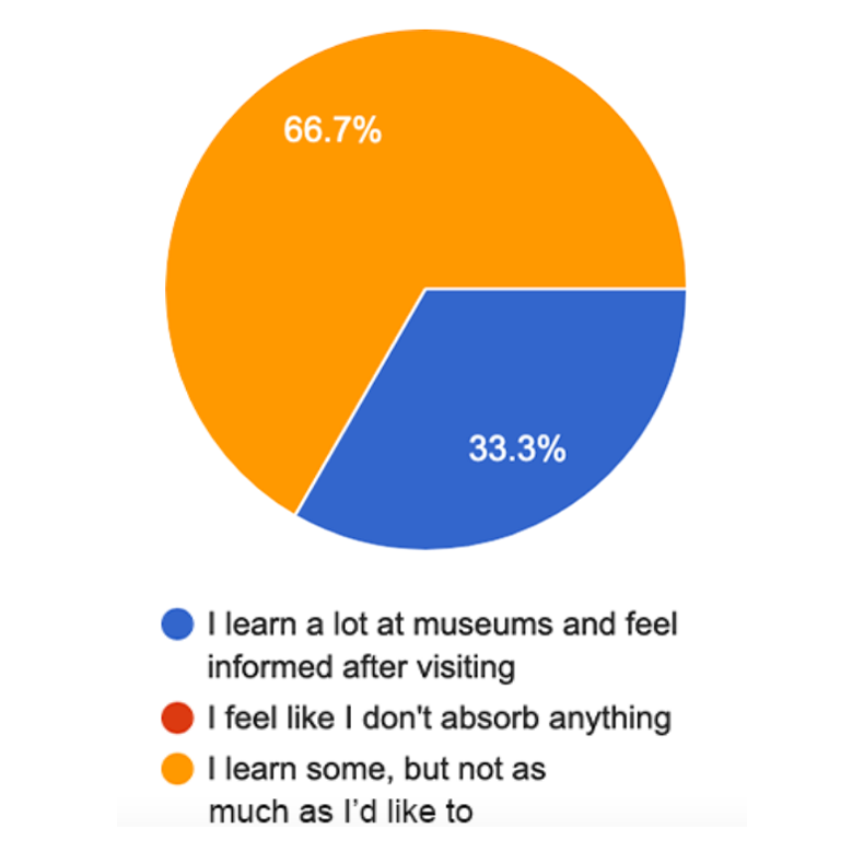
How much do you learn at a museum?
Day Two - Define
How Can We Create a Complete Experience?
Lightning Demo
For my lightning demo as opposed to looking at direct competitors in the museum space, I looked at other apps that were leading in the education space or apps that dealt with an issue I was considering incorporating in the GalleryPal solution.
This choice might seem odd for investigating for a museum app, but I wanted to look into how airbnb handles mapping items. I wanted some ideas to better think about how to present artwork in the context of a museum, as guests would need to be able to navigate the space to take an app guided tour. airbnb also has experiences which would be pretty comparable to the concept of a tour or piece of art so I delved into how they handled that with iconography, presentation, and categorization.
I started considering, should GalleryPal be laid out in a map of the museum? Should art be arranged on the map by type or even mappable by tag so people really have control over what they are viewing and how they are experiencing the museum? What if tours were based on a # or category vs touring by room, so people can choose how they want to experience the museum. Example: I only want to look at pastels today.

Next I explored duolingo which is more closely comparable being in the education space. This app does a great job of making information quickly digestible for learning. I wanted to see how a successful and popular app was handling the learning experience. They implemented some nice features like learning broken down by knowledge level and quiz-based education making information bite sized and easily digestible. Likewise the unit structure/visual structure for how to walk through information was laid out well.
Khan Academy is the most closely comparable app the GalleryPal and even has lessons within its curriculum on art. I wanted to see how another popular education app was directly handling art education. I was actually surprised that it was the least successful for this problem space. I determined Khan Academy would not be a good app to directly emulate for my users. The information is too dense and text heavy, an issue specifically addressed during user interviews. There were a few features that did stand out such as the “surprise me” button to get a random lesson to learn, some great and very thorough categories/topics breakdown, and the “next button” to progress through topics which you will see later will be adopted in GalleryPal.

Source: @tatyanaaboutart1
Finally I looked at Tik Tok. I see more and more people turning to video for learning, especially brief videos, and many apps are adopting video clips to drive traffic. My assumption is that many people nowadays best consume information via short 30-60 second videos. Coming from a background in design for marketing, video ads I made performed best with consumers when short and to the point.
Tik Tok is the leading app in this digestible video space. Tik Tok is highly scrollable and very easy to digest. Some nice features are closed captions on many videos and the rich tagging. This furthered a concept that I was chewing on for GalleryPal, that people could QR scan to orient the app and then consume videos on each painting. Videos could come from art historians, museum curators, artists could make it a very engaging experience.
Crazy 8s Sketch
Reviewing my maps the most critical screen to solving the problem was how the user would view the information about the specific painting/art piece. This is where the guest will truly be learning. How the guest gets to this page is also critical, but this is where the real meat of the experience is, so I went through a Crazy 8s Sketch, 8 screen iterations in 8 minutes.
-
![Crazy 8 - Sketch 1]()
Crazy 8 - Sketch 1
A combination of text with a grid of videos. Videos have descriptions and #s.
-
![Crazy 8 - Sketch 2]()
Crazy 8 - Sketch 2
Introductory video on artwork followed by tabs on different topics populated with videos.


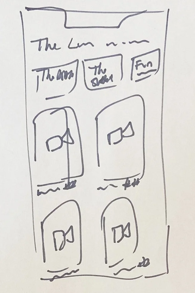


Solution Sketch
Now I start to rough out the interactions around my most critical screen. I selected one of my Crazy 8s screen sketches, iterated on it and determined how you would get to and leave this screen.

Step 1
On the left is how the user starts their experience by scanning a QR code. They would take their phone, find the QR code next to the artwork and tap to bring up the next screen.

Step 2
In the middle is the critical screen showing how the information about the painting/ art piece would be presented. There would be navigation arrows at the top, then a photo of the artwork so the user knows they are viewing the appropriate piece. Next there would be the critical information: Title, artist, date, medium, location create, and description.
Following the critical information would be short videos from experts speaking to specific topics, such as the artist’s life, context of the artwork, interesting facts… etc. These videos would have descriptive titles and rich clickable tags. The menu at the bottom would be simple and have home, QR, search, and profile buttons.

Step 3
On the right the app is navigating the user to the next painting. There would be a small image of the painting with its title, location, and approximate distance away. There would be a map of the museum zoomed in on the user and the next painting. Then an “I’ve Arrived” button so the app gets the feedback that you have made it to your destination.
*This is crucial to the experience, by eliminating the number of QRs needed to be scanned and not requiring location services we reduce steps and the data load on the mobile device.*
Day Three - Ideate
Let’s Find The Solution
StoryBoard
Having determined the critical screen and started to sketch out the solution, I moved on to fleshing out all the remaining screens. First though I quickly brainstormed through what would make my Minimum Viable Product.
MVP
Info pages for each painting/art piece
Artist
Date
Medium
Where created
Synopsis
Instructive videos
QR reader
Navigation/orientation through museum
Search
Don’t make guest scan QR code to confirm painting everytime.
Want to make sure that guests who need a break could possibly keep enjoying the museum while seated (ie elderly, disabled… etc). Could be a nice way to enjoy the museum in person with less effort.
Unnecessary
Log in/account/Profile
This would be a nice to have to save info, but would be added burden on user to start and more complexity than needed for this sprint
By keeping app from having to keep a large database for users/guests, app remains more streamlined and less expensive for museums
Comment/notes/favorites
as this would need login capabilities to save, instead can allow user to message themselves or others with the painting and any thoughts they had
Ways to promote tour over self guided
Info button for information on the museum
Bathrooms
Store
Hours
Purchase tickets
Choose your museum
First let’s work through the experience in one museum before scaling up to a multi museum experience
I broke the solution into two branches, one for self guided exploration of the museum and one for curated tours. Users had expressly stated in user interviews that they often enjoy exploring on their own freely, so there needs to be an option for self managed exploration.
Schedule Tests
Now I connected with the participants who passed my screener survey for Day 5 to keep on schedule.
Branch: Self Guided
-
![Launch screen]()
Launch
-
![Start screen]()
Start


Branch: Curated Tours
-
![Launch screen]()
Launch
-
![Start screen]()
Start


Day Four - Prototype
Look, Feel, Function
What Should the App Look and Feel Like?
GalleryPal should feel sophisticated and clean much like the museums and galleries it will represent. I made sure to keep the interface streamlined and minimal, but highly descriptive. Though our persona and users from our interviews may be young, it would be safe to assume that many future users could range in age from young to old. I wanted to make sure to bridge the gap for older users who may not be as tech savvy by keeping the app as straightforward as possible.
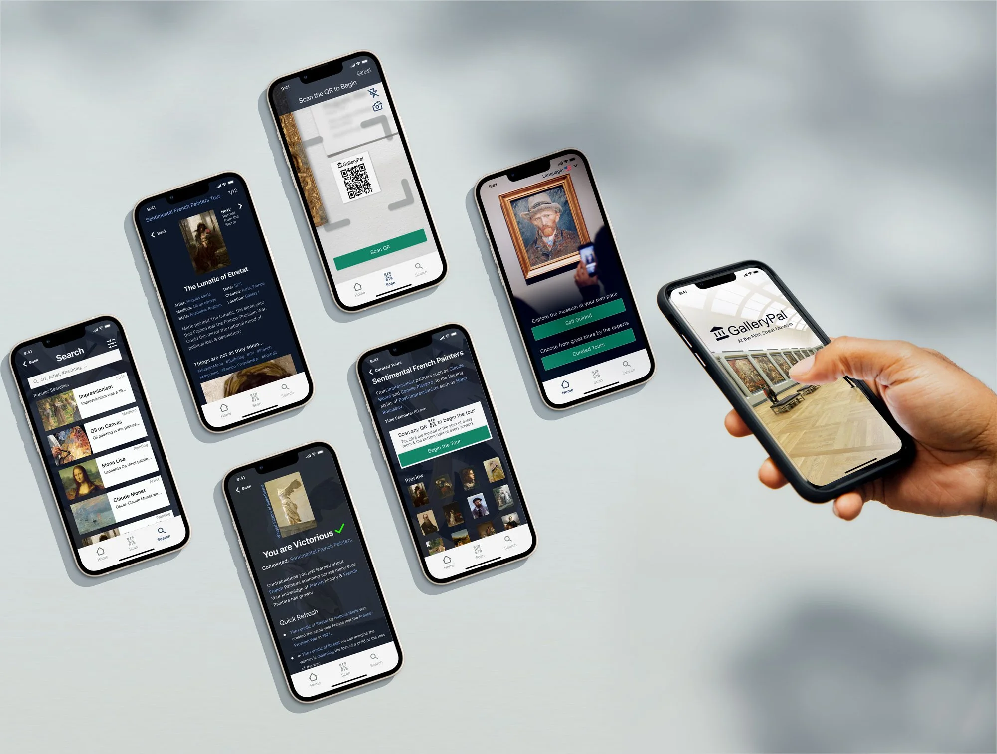
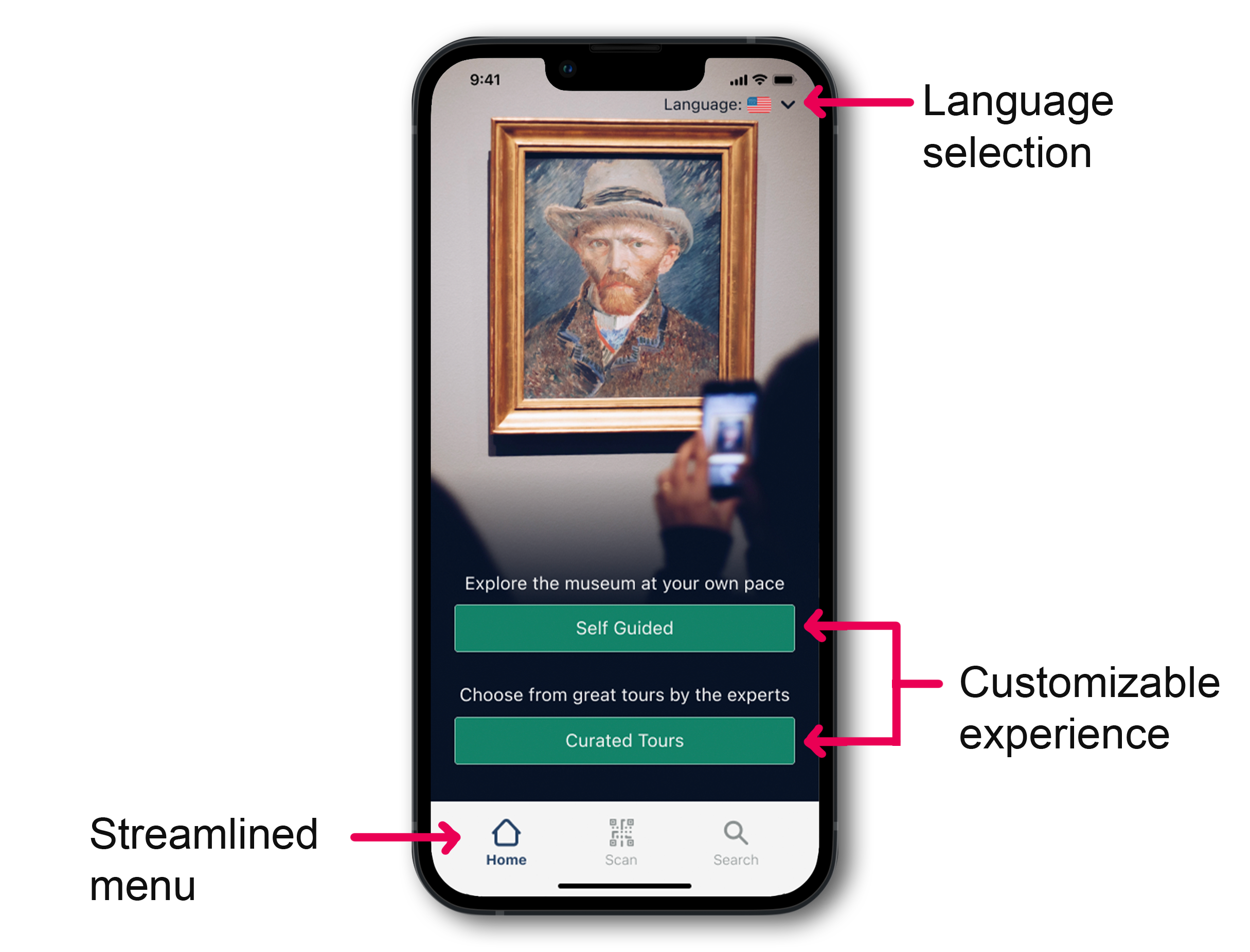
High Fidelity Screens & Clickable Prototype
Time to bring all my ideas and research to reality. Here are the high fidelity screens used to create the clickable prototype.
*Please note that I reference and include a couple frames from one of Tatyana's videos to best showcase the proposed solution for GalleryPal. I reached out to get permission and have not heard back yet, but have credited her work.*


Test
Time to Validate & Iterate
Interviews
Usability Tests
After working through my screens I built out a clickable prototype. Then proceeded with a round of usability testing, during which I tasked my participants with completing a set of tasks.
Example Task:
“How do you think you might learn more about the artist from here?.”
My usability testing went very smoothly. I tested with 5 participants. Through the testing I was able to determine areas for further improvement. I am pleased that my users felt that overall my app was simple to use and intuitive.


Usability Issues by Priority
Usability issue: Critical
The first finding was that the rich clickable content should be more clearly clickable and stand out from the rest of the text.
Usability issue: Major
Two users noted that some screens had too dense content and that they dislike reading. Since much of the content was necessary, the best course of action was to increase spacing and add more visual interest. The improved contrasting links also help to break up the text.
Usability issue: Major
One user wasn’t sure how to navigate back from specific screens like the location screen.
Usability issue: Minor
One user wanted only one button style in the UI, while this was not necessarily an issue it was a moment to reassess the design and find a more effective design that would work across all screens.
Try it Out


(Note: as a prototype not all features function)
Takeaways
Successes, Reflection, & What’s Next?
Test participants mostly had minimal issues when using the GalleryPal prototype and noted that the app was straightforward and intuitive. The most rewarding success was that individuals who actually frequented museums most enjoyed the app and expressed an interest in using it. Just the one round of usability testing created significant improvements in the UI and usability, but continued testing and iteration, as well as adding second launch features, would serve to improve this experience further.
Key takeaways:
Due to the specific time constraints of the Design Sprint I focused very keenly on what was most critical for the minimum viable product.
Many of my decisions to maintain a lightweight product also work well for the museum space. Keeping this solution lightweight through Limiting database needs, allows for lower operating costs to museums and limits requests for user permissions.
My solution came from the client and brainstorming what I learned from my research and testing.
I didn’t “rebuild the wheel”, but let existing patterns inform my design and this paid off as I could see during my usability testing. My users' struggles were minimal and easy to resolve.
References:
1. Serraino, T. (1970, February 3). History of art: Aboutart. About Art. Retrieved July 29, 2022, from https://www.abourtart.com/