

Overview
Motivation can be elusive in a health and fitness journey. Goals are easy to make, but hard to keep. Crunch Social is a health & fitness app that utilizes your social network to facilitate support and increased engagement. It makes health & fitness goals more attainable.
Role
User research
Ideation
Visual design
Prototyping
Testing
Tools
Figma
Marvel
Photoshop
Platform
Mobile
(Note: as a prototype not all features function)
[On pursuing health & fitness goals]
“It takes a lot of motivation to make a lifestyle change … Motivation is super elusive … You definitely need social accountability.”
- Participant 1
Defining The Problem
Sticking with Tools, Wearables, & Resolutions
The Problem:
Crunch Social does not currently have a social component/integrated messaging. Health & fitness motivation can be elusive and hard to maintain. Crunch Social is a health & fitness app that encourages greater engagement through social interaction to promote social accountability and facilitate success. My design challenge was to uncover the true problem and to discover the appropriate solution to improve user retention & goal accomplishment.
Constraints
Keep existing app elements and features.
Client wants the solution to be designed for mobile devices.
The Solution:
Before creating a solution, I needed to confront and understand the problem. I needed to make sure that direct messaging was the best way to promote engagement and motivate. I went through the design thinking methodology: empathize, define, ideate, prototype, and test to best understand my users and their needs. I determined that people struggle to stay motivated in health & fitness but find support from social engagement. So I designed integrated social experiences within the Crunch Social app to encourage greater sociability and social accountability.
Design Process
What Did I do?
My role was to undertake the whole project from concept to creation and everything in between. I worked on research, evaluation, design, and iteration. In the figure below you can see how I implemented The Design Thinking Model used and work implemented.
Empathize
Understanding The Problem & The Competition
Interviews
I interviewed 5 individuals to determine what functionality would truly benefit the user. From the brief I had an understanding of the problem space, but I needed to understand users’ frustrations and their motivations.
Looking at the interview data we can see the importance of social motivation. Interview participants directly related their experiences and/or desires for accountability partners. There are clear indications that messaging and social features would benefit the user experience.
Secondary Research
It is noted that physical activity is key in reducing the risk of obesity and that apps can help motivate, but “encouraging app engagement remains a challenge, thus limiting the app's efficacy” ⁶. We can gain an understanding of the success of individuals who’ve decided to make a health change through their ability to stick with an app, wearable, or resolution. 62% of people who download an activity tracking app abandon it after 2 weeks ¹. 50% of fitbit users also abandon it after 2 weeks ⁸. In a study from Statista only 9% of 342 respondents felt that they had maintained their new year's resolutions ⁵. So it is clear that people struggle to keep up with their health goals. How then can people be motivated to stick with their goals?
In one study where 190 individuals participated, the researchers examined motivations for participation in fitness. Factors studied were ‘health’, ‘competition’, ‘body and appearance’, ‘social and recreation’, ‘skill development’. Social factors were large in motivating fitness; “While it is seen that the preferential factor motivating the individuals doing fitness and kickbox to the recreational exercise is the health factor, it is respectively followed by social and recreation, competition, skill development and body and appearance factors” ⁴.
“Our findings indicate that sharing fitness data with pre-existing social networks motivates users to continue self-tracking and enhances their existing social relationships” ³. Dr. Graef, mental performance coach and sport psychologist, stated that “Sharing your intentions with friends is an effective way to maintain healthy habits” ². He will often provide tips to his patients on how to utilize social motivation to maintain healthy habits. Studies show that social motivation from a partner or friend can increase exercise habituation ⁷.

Key Findings
There is high abandonment for apps, wearables, and resolutions
Sharing health & fitness with social networks is motivating
Participants expressed a desire for social accountability partners
Participants wanted to be able to share their progress
Participants want the option to workout with others
Participants are visual and like visual inspiration from others and themselves
Synopsis
People want to make changes to their lifestyles with health & fitness, but motivation is hard to maintain. It is clear that social motivation can be a key factor in increasing motivation and therefore upping the success of meeting goals. This proves that the company's goal of adding in social messaging would be beneficial, through the research direct messaging would not be the most effective solution however and a multifaceted approach to implementing social features would be best.
Users directly expressed a desire for social accountability; research backs up this finding. There are multiple avenues to build social features into Crunch Social, key being building in social accountability, the ability to workout with others, and the ability to share and view progress.
Define
How Might We Improve Motivation?
To address the question above I needed to further explore what functionality would truly benefit the user, but also what solutions currently exist in the market.
Competitive Analysis
For my competitive analysis, I looked at some of the most popular apps in the health & fitness space. I wanted to see how the most popular apps were handling this problem space.

First I investigate Nike Run Club, a fitness app specifically designed for runners. It boasts guided runs, training plans, trackers, and community. I specifically focused on the community aspect of Nike Run Club as this was the focus of the improvements desired for Crunch Social. How does Nike Run Club create community and social engagement? You are able to connect with friends, post progress/updates, comment and like, and it has challenges which you can participate in with friends/the community.
However the biggest perk of the Nike Run Club, the community is not great in its zero state. Until you add friends you can’t see any community. For the club component itself there are minimal interactions amongst members, just a leaderboard and the challenges are not visually or socially engaging.
Actionable items:
My solution should have ability to share progress/updates
Need to plan for zero/empty state if no friends, should feel sense of community without having to add friends
People should have option to share publicly
Club/Community should be more visually engaging and open

Next I explored Map My Run, another fitness app geared toward running. This app comes with tracking, training plans, as well as community. Unlike , this app has a great zero state in the explore section of the app. You can immediately feel a connection to the Map My Run community. You are able to connect with friends, post progress/updates, comment and like posts, and there are challenges you can set up with friends. For social challenges aren’t prominently featured and though visually appealing on their splash pages, challenges aren’t socially engaging beyond a leaderboard.
Actionable items:
My solution should have the ability to share progress/updates
Emulate Map My Run’s great zero state for an immediate sense of community
Friend Challenges should be highly visible
Challenges should have more community engagement

Productive is the least closely comparable app to Crunch Social as it is primarily a challenge based app without a fitness focus. I looked at this app because I wanted to see how a non fitness app was approaching building community around goals. This app has a visually appealing and engaging interface. It builds community through challenges which are diverse and interesting. There are clear calls to action and an ability to invite friends. There is also a discussion section for challenges, which was missing from Nike Run Club and Map My Run. Productive fell short when it came to the general community, which appears to not exist. The discussion section is purely text based and not visual. It is also not clear how you can interact with just your friends.
Actionable items:
Challenges should be this effectively laid out, with a discussion section
Discussion section should be more visually engaging like NRC or Map My Run and visual and post based.
Defining the Brand
Brand Personality
A trusted friend with a good sense of humor who always has your best interests in mind.
Brand Attributes
Contemporary • Trustworthy • Humorous • Motivational
Brand Colors
Brand Imagery
Brand Fonts
Brand UI Elements
Brand Iconography
Ideate
Let’s Find The Solution
Having determined the brand look and feel and explored the problem space, I brainstormed through what would make my Minimum Viable Product.
MVP
An app that increases goal success and user retention through assisting in social engagement and support.
Existing app features
Social accountability buddies (via friends & family)
Social accountability buddy (paired via app)
Shared workout times/challenges
Share milestones/progress on your own terms, choose what app shares
In workout messaging
Direct messaging
Second Launch
Nudges to share and interact via app
Leaderboards
Challenges
I determined that as the company’s goal was to integrate social messaging, challenges were not a direct business solution that worked within the scope of existing features
User Flows
Having determined the Minimum Viable Product, I worked through user flows to determine all the steps needed to meet this MVP.
Route 1 (New User): Add accountability partner and encourage.
Route 2 (Return User): Give encouragement during a workout.
Route 1 (New User)
A new user goes through the onboarding experience where they provide key information about their lifestyle and personal goals, then choose or are paired with an accountability partner. The flow ends with the user interacting with their accountability partner within the homepage of the app.
Route 2 (Return User)
An existing user wants to workout and upon browsing workouts, finds one of interest, begins the workout, and interacts with the virtual class.
Prototype
Look, Feel, Function
Sketches
With the user flows at the forefront of my mind, I began sketching low fidelity screens.
I spent a lot of time referencing patterns from other apps, to ensure this app would have a sense of familiarity for the user and also to consider all possible solutions to a problem. I took special consideration of the most popular fitness apps explored during the competitive analysis as well as popular apps such as MINDBODY. These apps do a great job of presenting their content in a simple, easy to digest, and visually appealing way, with rich categorization and search capabilities.
-
![Log In]()
Log In
-
![Sign Up]()
Sign Up
-
![Onboarding Start]()
Onboarding Start
-
![Onboarding Goal Screen]()
Onboarding Goal
-
![Onboarding Goal Selected]()
Onboarding Goal Selected
-
![Onboarding Habits Screen]()
Onboarding Habits Screen
-
![Onboarding Habits Selected]()
Onboarding Habits Selected
-
![Permissions]()
Permissions
-
![Add Friends]()
Add Friends
-
![Friends Added]()
Friends Added
-
![Choose Accountability Partner]()
Choose Accountability Partner
-
![Friends List]()
Friends List
-
![Accountability Friend Selected]()
Accountability Friend Selected
-
![Home]()
Home
-
![Encourage Friend]()
Encourage Friend
-
![Encourage Friend Typing]()
Encourage Friend Typing
-
![Encouragement Sent]()
Encouragement Sent
-
![Search Zero State]()
Search Zero State
-
![Searching]()
Searching
-
![Search Results]()
Search Results
-
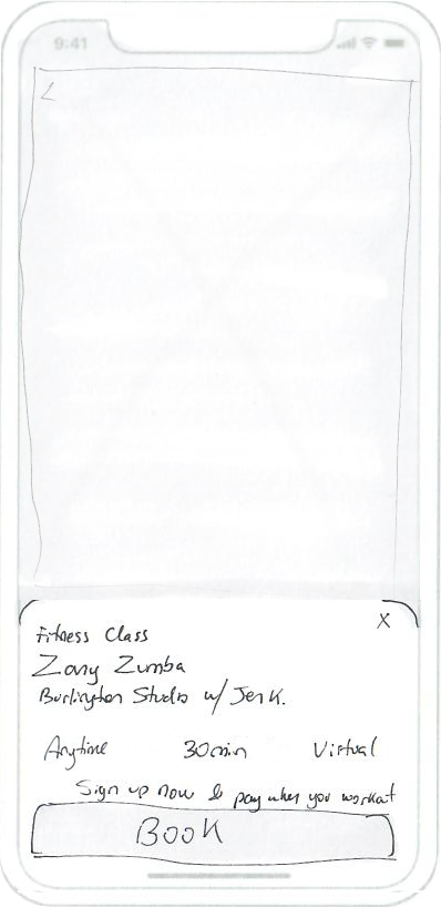
![Class]()
Class
-
![Book Class]()
Book Class
-
![Booked]()
Booked
-
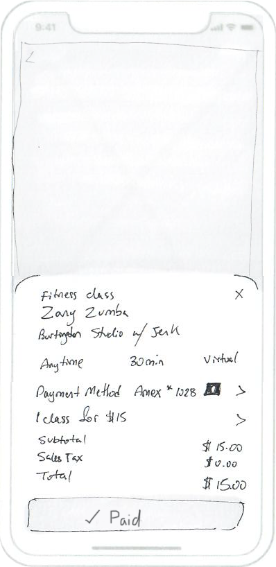
![Pay]()
Pay
-
![Paid]()
Paid
-
![Live Workout]()
Live Workout
-
![Live Workout Typing Chat]()
Live Workout Typing Chat
-
![Live Workout Commented]()
Live Workout Commented
-
![Feed]()
Feed
-
![Feed Typing]()
Feed Typing
-
![Add Photo]()
Add Photo
-
![Select Photo]()
Select Photo
-
![Photo Selected]()
Photo Selected
-
![Post]()
Post
-
![Posted]()
Posted


Initial Test
Time to Test the Initial Solution
After working through wireframing my flows and accounting for edge cases, I built out a low fidelity clickable prototype. Then proceeded with a round of moderated usability testing, during which I tasked my participants with completing a set of tasks.
Example Task:
“Please find a way to share your fitness progress with your friends.”
The majority of my participants did not struggle with any of my tasks, but the testing did uncover areas for improvement and where my flows needed further refinement. Majority of feedback surrounded the onboarding experience and minimal friction completing the meat of the tasks.
Changes needed:
Make sure add vs invite during onboarding when adding friends is clear and understandable.
Create clearer visual and informational distinction between choosing and being paired with an accountability partner.
Clearer confirmation feedback surrounding accountability partner choice.
Make sure interests during onboarding are as all encompassing as possible.
Add clarity over name field in onboarding. One user wondered whether the app needed their full name or just their first.
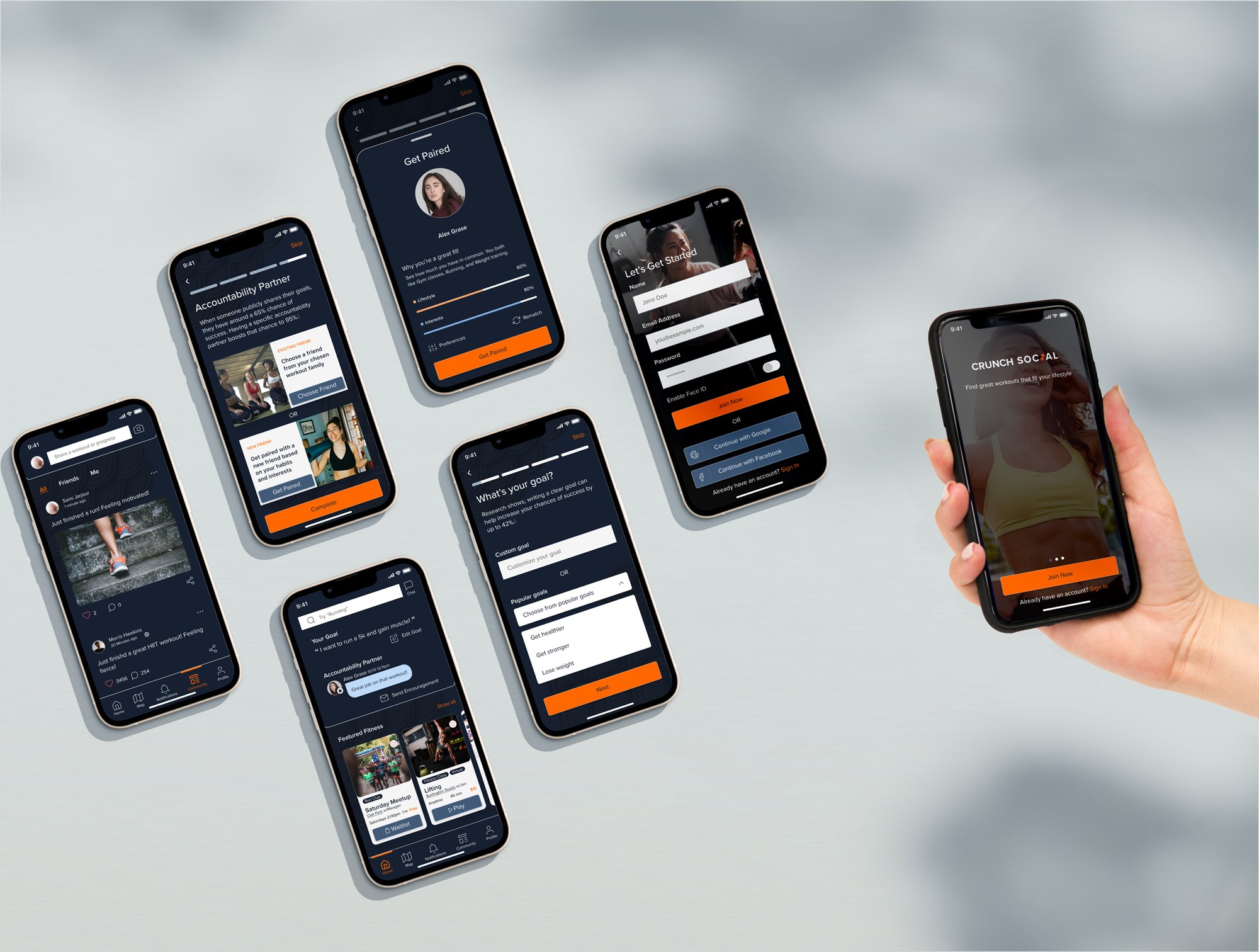
High Fidelity Screens & Clickable Prototype
Time to bring all my ideas and research to reality. Here are the high fidelity screens used to create the clickable prototype.


Test
Time to Validate & Iterate
Usability Tests
After working through my screens I built out a clickable prototype. Then proceeded with a second round of usability testing.
My usability testing went smoothly. I tested with 5 participants. Through the testing I was able to determine areas for further improvement. I am pleased that my users felt that overall my app was simple to use and intuitive.
Usability Issues by Priority
Usability issue: Critical
The first finding was that the rich clickable content should be more clearly clickable and stand out from the rest of the text.
Usability issue: Critical
One participant wanted to choose gender for getting paired. This is actually quite important and would be critical for many users. It was interesting that this didn’t come up for anyone else as an issue.
Usability issue: Major
One participant wanted to pay first then workout. This is a common feature in many payment patterns and would be quite impactful to adopt.
Usability issue: Major
Need to add 0 option for workout frequency in onboarding. This is a small change but quite important as otherwise not everyone’s experience is accurately included.
Usability issue: Major
I had two participants note that they don’t like filling out text fields for goals and would prefer a dropdown of options. One participant noted that when they are faced with a text field they tend to skip onboarding. As onboarding can help improve a user's overall app experience, it should be convenient for the user so they are encouraged to complete onboarding.
Usability issue: Minor
One participant wanted an indicator that the match happened during onboarding. This had been addressed from round 1 testing with checkmarks and animations and no other participants had any issues, but is worth addressing for further clarity.
Try it Out


(Note: as a prototype not all features function)
Takeaways
Successes, Reflection, & What’s Next?
Test participants mostly had minimal issues when using the Crunch Social prototype. The most rewarding success was that some participants expressed an interest in using it. Just the one round of usability testing created significant improvements in the UI and usability, but continued testing and iteration, as well as adding second launch features, would serve to improve this experience further.
Key takeaways:
My solution came from the client and brainstorming what I learned from my research and testing.
I didn’t “rebuild the wheel”, but let existing patterns inform my design and this paid off as I could see during my usability testing. My users' struggles were minimal and easy to resolve.
Perfecting the onboarding process takes great consideration and finesse, especially if you want to encourage users to complete the process.
Feedback feedback feedback. Always be looking for ways to provide clear feedback at every step. When in doubt increase the feedback to the user.
Design for greatest clarity. Increasing clarity of language and visuals for one user can improve clarity for all. Design so there is no question what the next step is.
References:
1. Gouveia, R. et al. “How do we engage with activity trackers? A longitudinal study of
Habito. In Proceedings of the 2015 ACM International Joint Conference on Pervasive and Ubiquitous Computing”, Osaka, Japan, 7–11 September 2015.
2. Graef, PhD, Stephen. “Sharing Fitness Goals on Social Can Hold You Accountable.” Wexnermedical.osu.edu, 10 July 2017, wexnermedical.osu.edu/blog/sharing-fitness-goals-on-social-media-can-hold-you-accountable. Accessed 13 Sept. 2022.
3. Gui, Xinning, et al. “When Fitness Meets Social Networks.” Proceedings of the 2017 CHI Conference on Human Factors in Computing Systems - CHI ’17, 2017, dl.acm.org/citation.cfm?id=3025654&dl=ACM&coll=DL#URLTOKEN#, 10.1145/3025453.3025654.
4. Kaya, Erdi. “Investigation of Motivation Levels of Individuals Doing Fitness and Kickbox
for Recreative Activity Purpose in Terms of Some Variables.” Journal of Education and Training Studies, vol. 7, no. 10, 22 July 2019, p. 11, 10.11114/jets.v7i10.4325.
5. “Perseverance with New Year’s Resolutions in the U.S. 2019.” Statista,
www.statista.com/statistics/1076481/perseverance-with-new-year-s-resolutions-in-the-united-states/. Accessed 7 Sept. 2022.
6. Saksono, Herman, et al. “Storywell: Designing for Family Fitness App Motivation by Using
Social Rewards and Reflection.” Proceedings of the 2020 CHI Conference on Human Factors in Computing Systems, 21 Apr. 2020, 10.1145/3313831.3376686.
7. Sg, Trost, et al. “Correlates of Adults’ Participation in Physical Activity: Review and Update.” Medicine and Science in Sports and Exercise, 1 Dec. 2002, pubmed.ncbi.nlm.nih.gov/12471307/.
8. Shih, P.C., et al. “Use and Adoption Challenges of Wearable Activity Trackers.